New Paint Scheme

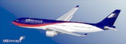
There is a picture in Clt floating around with a U S Airways jet in a new paint scheme. The colors are red, white and blue with a very fluid like pattern which I thought was very attractive. The logo flag on the tail was also more flowing. It was suggested that this will be the look sought post merger. It would seem premature especially for U. I always thought the only planning done there was for the golden parachutes and "keep managers" bonus slush funds.
 
Looks like it's just someone's hope.
 

Attachments

  • justanidea.jpg
    justanidea.jpg
    16.9 KB · Views: 27,786
It looks like BMI British Midland. If there was a new scheme, it wouldn't be a made up one from a fan, it would be professionally designed. It would be especially dumb to change the logo as it would make rebranding that much more difficult.

I'd prefer they keep the current one, but with red Express planes and white Shuttles. We just got rid of the silver ones. We don't want to look like Delta with five slightly different liveries flying around.

I love the current one- it's classy, sharp, and timeless. I hope it stays.
 
Either way you cut it a large number of planes will need to be repainted and a large number of employees will need new uniforms. I would take this opportunity to design a new livery yet keep the US flag as-is.
 
Piney,

If you had to spend your whole summer inside one of those dark blue aluminum torture tubes then you wouldn't think the paint scheme is all that great.

Besides, it looks so dark and dreary.
 
Who is going to keep the white part clean ( due to lack of maint. and removeing the cleaners the skydrol leaks look nasty), our planes look bad in dark colors wait till you see it in light colors. You have to take care of what you have before you deserve something new, this airline needs more than a new paint job.
 

Latest posts