UNITED's new colors and website

ContUNITEus

Veteran
May 4, 2011
501
580
I still can't get used to the new colors at United Airlines. This hybrid color-scheme of theirs is really novice and ugly. Continental's paint job with the Continental titles looked good, but United, U N I T E D or even united just don't look good with the whole scheme. The glove can be made to work as the new logo for the company but the design and colors need to be tweaked a bit. A little bit more needs to be put into the imagination.

The same issue also hold true with the transition to the CO website. I thought that they were going to come up with a brand newly designed website, with new artwork and all. But no, instead they went to the continental website and changed the name there to United. It just reeks of cheap. Plus, stuff is disorganized and cannot be found correctly. The top bar stretches too far on both sides of the site when the sites content is relatively small and stays centered in the browser. It's like a kindergarten website.

I give United two thumbs down for poor execution of transitioning to Continental stuff.
 
  • Like
Reactions: 2 people
I still can't get used to the new colors at United Airlines. This hybrid color-scheme of theirs is really novice and ugly. Continental's paint job with the Continental titles looked good, but United, U N I T E D or even united just don't look good with the whole scheme. The glove can be made to work as the new logo for the company but the design and colors need to be tweaked a bit. A little bit more needs to be put into the imagination.

The same issue also hold true with the transition to the CO website. I thought that they were going to come up with a brand newly designed website, with new artwork and all. But no, instead they went to the continental website and changed the name there to United. It just reeks of cheap. Plus, stuff is disorganized and cannot be found correctly. The top bar stretches too far on both sides of the site when the sites content is relatively small and stays centered in the browser. It's like a kindergarten website.

I give United two thumbs down for poor execution of transitioning to Continental stuff.
I totally agree. I like the idea of calling the airline "UCA" for United Continental Airlines would be interesting.
 
I still can't get used to the new colors at United Airlines. This hybrid color-scheme of theirs is really novice and ugly. Continental's paint job with the Continental titles looked good, but United, U N I T E D or even united just don't look good with the whole scheme. The glove can be made to work as the new logo for the company but the design and colors need to be tweaked a bit. A little bit more needs to be put into the imagination.

The same issue also hold true with the transition to the CO website. I thought that they were going to come up with a brand newly designed website, with new artwork and all. But no, instead they went to the continental website and changed the name there to United. It just reeks of cheap. Plus, stuff is disorganized and cannot be found correctly. The top bar stretches too far on both sides of the site when the sites content is relatively small and stays centered in the browser. It's like a kindergarten website.

I give United two thumbs down for poor execution of transitioning to Continental stuff.
Still say Continental should have merged with Aer Lingus! Could have been called Conti-Lingus
 
  • Like
Reactions: 2 people
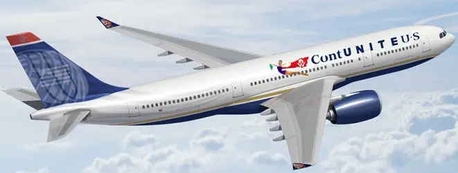
I still think that the best color scheme was this one in the attachment. ContUNITEDUS.jpg
 
  • Like
Reactions: 1 person
I still can't get used to the new colors at United Airlines. This hybrid color-scheme of theirs is really novice and ugly. Continental's paint job with the Continental titles looked good, but United, U N I T E D or even united just don't look good with the whole scheme. The glove can be made to work as the new logo for the company but the design and colors need to be tweaked a bit. A little bit more needs to be put into the imagination.

The same issue also hold true with the transition to the CO website. I thought that they were going to come up with a brand newly designed website, with new artwork and all. But no, instead they went to the continental website and changed the name there to United. It just reeks of cheap. Plus, stuff is disorganized and cannot be found correctly. The top bar stretches too far on both sides of the site when the sites content is relatively small and stays centered in the browser. It's like a kindergarten website.

I give United two thumbs down for poor execution of transitioning to Continental stuff.

You guys stupid this is Continental airlines now its United in name only they run everything and we are switching to everything they do. And their web site does suck United's site was better more organized very easy to use. Continental's web site was developed by a bunch of retarded geeks who think all us normal people think like they do they look at the site and say brilliant we look at it and say what a bunch of morons...
 
  • Like
Reactions: 1 person
Just returned from BKK aboard UA. The flight crew was ex-CO and very proud of that fact. One even told me 'if you're on a plane with lay-flat seats you know it is CO and if you're on a creaky 747 you know it is UA'

I wouldn't worry about the color schemes of the new airline. Just get all the employees to believe in the new company. You don't want to become the abomination that USair has become seven years after a merger and they're still not working together on the same contract.

Personally I hope the CO culture prevails over the old UA mindset. The old UA was a great airline, they just got distracted by political nonsense and ridicule (remember the CEO who warned of the necessity to 'change or perish') but UA is the great, global brand name and they were wise to keep it. A dose of vigor and boldness is the testosterone shot that this company needed.

Besides, in a few years some MBA-wunderkind consultant is going to convince the new UA to refresh their color scheme anyway. Let's just hope it is not the same bozos who concocted TED.
 
How about we call it CONU Airlines.... Continental is a low budget airline at least with United we were up to date with technology... shares = low budget technology created before i was even born! New flight benefits suck plain and simple... companions now have to pay for business class a different rate from coach... on weblist at least it was one set fee! Point is they tried to shove that continental working together garbage down our throats... Now our relationship with upper management isn't like continental but me as a person i rather keep it that way then try and be buddy buddy with them and have them back stab us... You can trust management if you want but after this CEO leaves watch United implement a real UNITED CEO as in one you can't trust... that is all i have to say
 
  • Like
Reactions: 1 person
Just returned from BKK aboard UA. The flight crew was ex-CO and very proud of that fact. One even told me 'if you're on a plane with lay-flat seats you know it is CO and if you're on a creaky 747 you know it is UA'

I wouldn't worry about the color schemes of the new airline. Just get all the employees to believe in the new company. You don't want to become the abomination that USair has become seven years after a merger and they're still not working together on the same contract.

Personally I hope the CO culture prevails over the old UA mindset. The old UA was a great airline, they just got distracted by political nonsense and ridicule (remember the CEO who warned of the necessity to 'change or perish') but UA is the great, global brand name and they were wise to keep it. A dose of vigor and boldness is the testosterone shot that this company needed.

Besides, in a few years some MBA-wunderkind consultant is going to convince the new UA to refresh their color scheme anyway. Let's just hope it is not the same bozos who concocted TED.
Abomination huh? Whatever dude ..
 
I still can't get used to the new colors at United Airlines. This hybrid color-scheme of theirs is really novice and ugly. Continental's paint job with the Continental titles looked good, but United, U N I T E D or even united just don't look good with the whole scheme. The glove can be made to work as the new logo for the company but the design and colors need to be tweaked a bit. A little bit more needs to be put into the imagination.

The same issue also hold true with the transition to the CO website. I thought that they were going to come up with a brand newly designed website, with new artwork and all. But no, instead they went to the continental website and changed the name there to United. It just reeks of cheap. Plus, stuff is disorganized and cannot be found correctly. The top bar stretches too far on both sides of the site when the sites content is relatively small and stays centered in the browser. It's like a kindergarten website.

I give United two thumbs down for poor execution of transitioning to Continental stuff.

IMHO,
Most passengers (not frequent flyers) do not care what the exterior looks like, or care.
Furthermore, with code sharing, they don't even know who they are flying, or care until it's too late.
People do not look at DOT on-time performance (or know what it means).

Price Point is their goal!

B) xUT
 
  • Like
Reactions: 4 people
I still can't get used to the new colors at United Airlines. This hybrid color-scheme of theirs is really novice and ugly. Continental's paint job with the Continental titles looked good, but United, U N I T E D or even united just don't look good with the whole scheme. The glove can be made to work as the new logo for the company but the design and colors need to be tweaked a bit. A little bit more needs to be put into the imagination.

The same issue also hold true with the transition to the CO website. I thought that they were going to come up with a brand newly designed website, with new artwork and all. But no, instead they went to the continental website and changed the name there to United. It just reeks of cheap. Plus, stuff is disorganized and cannot be found correctly. The top bar stretches too far on both sides of the site when the sites content is relatively small and stays centered in the browser. It's like a kindergarten website.

I give United two thumbs down for poor execution of transitioning to Continental stuff.

United's new livery is a lot better especially the globe logo.
 
You can trust management if you want but after this CEO leaves watch United implement a real UNITED CEO as in one you can't trust...

Like you trusted every other CEO that ran United.........

Come on, do you really think were that stupid??
 
  • Like
Reactions: 1 person
Yes because Parker is a weak manager for allowing the east/west pilots' separate contracts to remain in effect since the merger.

On that point alone he should be fired if the board had any balls.

You may have that opinion of Parker, but the business world thinks he's brilliant. He may lose 20-30 million a year in synergies that could be attained by having the flight crew integrated, but on the other hand he is saving 150 million plus in wages that would have to be paid had they all gotten there acts together and agreed on a list and contract. The pilots are the weak ones in this fight. Infighting has caused the managers there to laugh along with Parker all the way to the bank. Parker is just sitting back and reaping the benefits while labor continues to shoot themselves in the foot.
 
  • Like
Reactions: 1 person