IMHO...
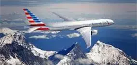
The typeface/size and new "eagle" logo are actually o.k. It is the tail that completely kills any acceptability of the rest of it! Just try and focus for more than a second on the fuselage. You can't because the tail overwhelms everything else.
Epic FAIL!
Once merger is announced, if they don't change it completely, I would hope DP and co at the very least replace the tail with perhaps the new eagle? Or the new eagle and an "AA" incorporated somehow?
Anything would be better.
The AA employees I know are absolutely over the moon about this design.